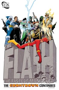
Last weekend I did a redesign of my comics fan site, Flash: Those Who Ride the Lightning. It was prompted by two goals:
- Get rid of the non-working compatibility cruft for Netscape 4 (some of it was actually making things worse in NS4)
- Make navigation easier.
I decided early on that I wanted to move to that old standby, the tab bar across the top of the page. I toyed around with using fixed positioning so it would stay in place like a toolbar, but couldn’t get same-page links to position themselves correctly. I also realized that the tab bar needed something above it, or else it would blend in with the browser’s toolbars. Solution: another old standby, the site logo above the tabs
After trying some more out-there ideas, I ended up with the rest of the page looking about the same as before. Having the logo at the top meant that I didn’t need a giant logo on the main page, freeing up space to add something I’ve meant to do for a long time: Post more obvious links to each of the main Flashes.
Something interesting I noticed: I’m now considering IE6 a second-tier browser. I’m building for IE7, Firefox, Opera and Safari first. I no longer care about minor issues in IE6, just major ones. I realized this when I decided to use an alpha-transparent PNG at the top of every page. Sure, I was able to use PNG Behavior to get it to look right in IE6, but that requires scripting, and it’s not the same as native support. (Now that I have that linked on every page, though, I can use alpha-PNGs anywhere without additional effort.)
I also decided to switch from XHTML, which I’d started using in the 2000 redesign, back to HTML 4.01. The site had never benefited from using XHTML, and HTML still has wider support, so I figured if I was going to be changing code anyway, I might as well take the opportunity.
I posted the new layout last Sunday, and I swear, within 10 minutes someone had sent a comment on it.
Monday was time for fixing bugs. Not surprisingly, the biggest ones were both in IE. They were two related bugs involving floats and italics that had the opposite effect in IE6 and IE7. They were also intermittent, only affecting particular pages and only with certain window sized, which is why I hadn’t caught them before launch.
IE6 encountered the Peek-a-boo Bug. On certain pages, text next to a floated image would not appear. IE7 encountered another disappearing content bug, in which the floated image itself would stop displaying below any line with italics. (What is it with IE7 and weird problems with italics?) It turned out both could be fixed by setting width or height on the article DIV, instead of letting it take the size of the container (which includes the footer), so I just made it 97% (since 100% confused IE6 even more) and had done with it.
Finally, I’ve added some enhancements for certain browsers using experimental CSS3 features. People visiting with Firefox or other Gecko-based browsers will see rounded corners on the tabs (it looks much better than the square-cornered version, but isn’t necessary), along with people using nightly releases of Webkit (with any luck, the feature will be in the next version of Safari). Really neat was box-shadow, so far only in Webkit. I was finally able to add the drop-shadows to the article and sidebar the way I wanted to back in my last redesign in 2002! I’m looking forward to seeing other browsers implement it.


I won’t act like I understood all of that, but it was still interesting.
I didn’t realize how deep this stuff got (although I should’ve) until you and another member of the discussion group started talking about different imaging options.
Neat stuff. Maybe, with a bit more exposure, I’ll decide to stick my foot into the pool.
It’s layered.
It’s possible to wade in a bit, and put together a perfectly serviceable site. It’s also possible to get more involved in optimizing performance, making the site easier to use, making sure it works on devices other than a standard computer (handhelds, for instance, or phones, or computers with screen readers for blind users). And of course, the more complicated the design, the more testing needs to be done across different browsers, because none of them cover 100% and each has its own bugs.
I’ve just been at this so long (started as a hobby in college, and turned into a job) that some of the deeper layers are second nature.
Impressive stuff.
By the way, yours was one of the first sites I ever discovered on “that internet thing” all those years, ago. I’m sure I’m not the only one, but Those Who Ride the Lightning was kinda like my introduction to the online world.
You also put up with a somewhat over-eager west3boy who was starved for people to chat with about The Flash.
So, in case I haven’t said it before: “Thanks.”
We now return you to your regularly-scheduled blogging experience.
[…] various browsers (IE’s bizarre concept of having layout, for instance, trips up all kinds of weird issues). And then there’s waiting for IE8 to be released, and moving people up from IE7, not to […]