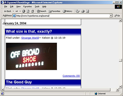
I finally put together a new layout! I tried to do as much as possible in CSS and leave the HTML as little changed as possible, and when I finished I was able to keep the default WordPress layout as an alternate. In theory I ought to be able to plug in any of the submissions from the WordPress CSS Style Competition as alternates as well.
It’s been tested so far on Mozilla, IE 6, Opera 7, and Konqueror 3.2. It doesn’t use anything more complicated than Fahrner Image Replacement, so it shouldn’t cause too many problems. I’ll try to test it in a bunch of other browsers at work tomorrow.
I consider this a first draft – among other things I figure on adding to the main title banner – but it’s something a bit more distinctive than the out-of-the-box layout we ended up with after the upgrade to 1.0.
Updated Feb. 12 and Feb. 13 to describe testing in more browsers and the interesting saga of tracking down a bug in Internet Explorer 5.0:
Update Feb. 12 @ 10:45. Well, I’ve successfully tested Opera back to 4.0, Mozilla back to 1.0, Netscape back to 6.2 and IE back to 5.5. I still need to check Safari and Mac IE 5, since Katie had turned her computer off by the time I was finished last night. (Gecko browsers are pretty consistent across platforms, so all I really need to check on Mac Mozilla is that the fonts are readable.)
So far, every browser that can be expected to handle the layout has shown it fully or reasonably, except one: IE 5.0 for Windows:

It looks like it’s treating the bottom margin of each post as padding, without moving anything out of the way. (Padding is inside the box, margins are outside.) It should be placing a blank line between the bottom of a post and the next item, but instead it’s extending the box down, causing an overlap with whatever comes next.
This reminds me of the margin problems IE 6 had with my software page layout – but this time IE 6 is fine. It’s only IE 5.0 that’s having problems, and the tweaks I allowed myself time to make haven’t been enough to solve them.
Well, if stats are to be believed, there aren’t too many of you out there still using IE 5.0. I’ll try to figure out a workaround, but for those of you still using IE 5, isn’t it time to think about either upgrading to IE 6 or switching to something better?
Update Feb. 13 @ 16:30. I took a quick look at the resulting HTML code, and suddenly it was obvious: every post on the main page, where comments aren’t visible, had the following code at the end: <div class="storycomment"></div>. It’s perfectly valid, and most browsers just ignored the empty element. If IE 5.0 had just added the blank space, it would have been okay, but it somehow added the space when displaying the surrounding block, but not when figuring out where to put the next block.
Anyway, I moved the <div> tags into the comment loop, so they’re only present when comments are actually shown. The IE 5 display problem is fixed!


One tiny annoyance in Safari; it does some slight gamma munging on PNG images, so the solid part of the blue header background doesn’t quite match with the top part of bluefade.png. I’m a bit disappointed they still haven’t fixed this in Safari 1.2…
Other than that looks good; also seems ok in IE 5.2.
*Sigh* It seems when I adapted the template for WordPress 1.2 last month, I ended up counteracting the work-around for the IE 5.0 bug, so anyone looking at the site with IE 5.0 during the last 3 weeks has seen the messed-up headers and borders. No one complained, which probably says something about the size of the IE 5.0 audience.
Fixed again.
I’m not getting the weirdness depicted in that screenshot, but here’s what I *am* getting:
1. In the individual-post screens, the border at the top stops about 1/4 inch from the right side of the white area on the right side. Not getting this on the main page. Resolution is 800 x 600.
2. The related posts on other blogs aren’t all showing up consistently, but all the space is allotted. I can force them to appear by highlighting them. This may be a problem with my terminal as this entire page has just done the same thing when I checked the preview (see #3).
3. Return of the Buggything with the input window. Huzzah for the preview. (If only I’d known about it when making my other post….blah.)
FYI/TMI, I’m on IE 6.0.2800.1106.
#1 is actually caused by #3, which isn’t quite the same as the original IE comment bug. It’s just that the textarea is too wide for this layout at 800×600, and the workaround for the original bug means it won’t shrink it to fit. I just dropped it from 70 columns to 63, which looks narrow enough.
#2 is an odd one – you’re probably right about it being the terminal. Though I noticed something interesting on this page. Right now Waypath is listing an apparently-related post in Japanese, and it’s screwing up the character set, resulting in long, unwrappable lines about twice the width of the page. And on IE, that means it stretches all the boxes to accommodate it, causing problem #1 anyway!